This guide provides a brief overview of the collaboration data available on the Headlines Summary report. Collaboration data shown within the reports is calculated using the data from all opted in schools within the Sisra Data Collaboration event published by your administrator.
Please note, Collaboration Headlines data will only be available within reports that have been published with collaboration report features by a Sisra admin at your school.
Data Collaboration Options
The Data Collab bar is shown within reports published with collaboration data. This includes various functionality (explained below) and displays which year and data collection window has been used within the calculations in the selected report.

| Icon | Description |
| Data Set Information – Displays which year’s DfE Rules, A8, and VA Estimates have been used within this report, as well as the data collection window used and the number of schools and students included within. | |
| Collaboration Data Qualification Grouping – Produces a list displaying which collaboration data ‘subject groups’ each of your qualifications are being compared with for use in Subject Progress Index (SPI) calculations. | |
| Show/Hide Collab Data – Toggles whether or not collaboration data will be displayed in the current report (shown in the additional blue columns). | |
| Actual/Difference mode – Toggles the calculations within transition matrices. When set to ‘Actual mode’ these will display your school figures, and when set to ‘Difference mode’ it will calculate and display the difference between your figures and those of the data collaboration. |
Headlines Summary
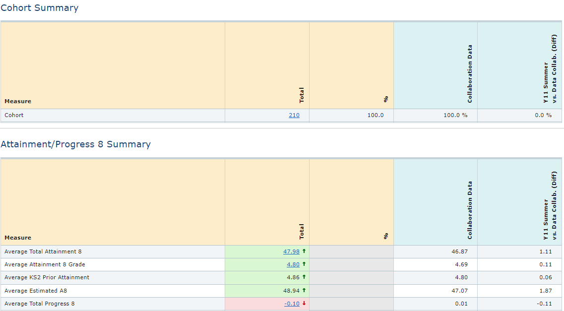
Data Collaboration figures are available for all appropriate Headline figures, represented by the blue columns in the reports. Here, colour coding will be applied automatically to compare your data to the collaboration data (based on the performance of the Analytics schools who have opted in and are included in the Data Collaboration). Analytics will also calculate the difference between the Main Focus figures and Collaboration figures.

Key Filter Breakdown
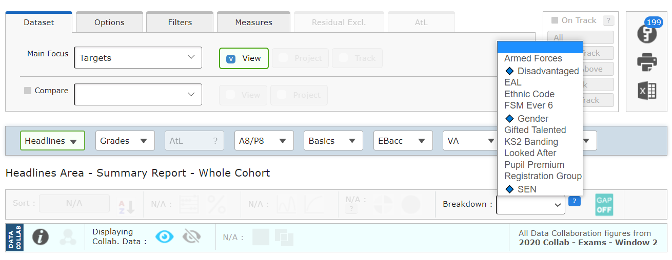
The Breakdown dropdown allows you to break down data to look at ‘gaps’ within a specific filter. Using this, you can compare the figures for individual filter values within a selected filter and compare these to the overall total for the cohort.
Any filters marked with a diamond in this dropdown will provide like-for-like comparisons with Headline collaboration data. Depending on your schools setup, this may be available for Disadvantaged, Gender, and SEN.

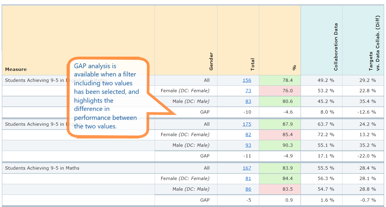
For example, selecting Gender will allow you to view how your female/male students performed against all Sisra female/male students (for schools opted-in and included in the data) across all Headline performance measures. The screenshot below shows this comparison for Headline 9-5 figures for the Basics 9-5 measure.

Thanks for reading.
